
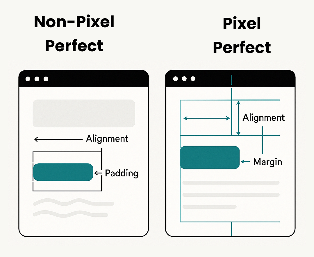
Pixel-perfect design or development means designing and developing a digital interface (website/app) so every visual element displayed exactly how you intended, they were right on the pixel. To have perfection at this level means to closely align, space, color, and integrity from every device and screen resolution. The result? A user experience that feels clean, polished, and professional enhances your overall product. In short, pixel-perfect design aims to replicate design mockups in code without any deviation.
Attention to Detail
Every pixel is purposefully placed, showcasing the developer’s precision and care.
Small refinements collectively elevate the overall quality and professionalism of the product.
Enhanced User Experience
A polished, consistent UI helps users navigate effortlessly and builds confidence.
Visually cohesive interfaces feel more intuitive, reducing friction and confusion.
Pixel perfection is important in delivering a high-quality user experience because it creates interfaces that are:
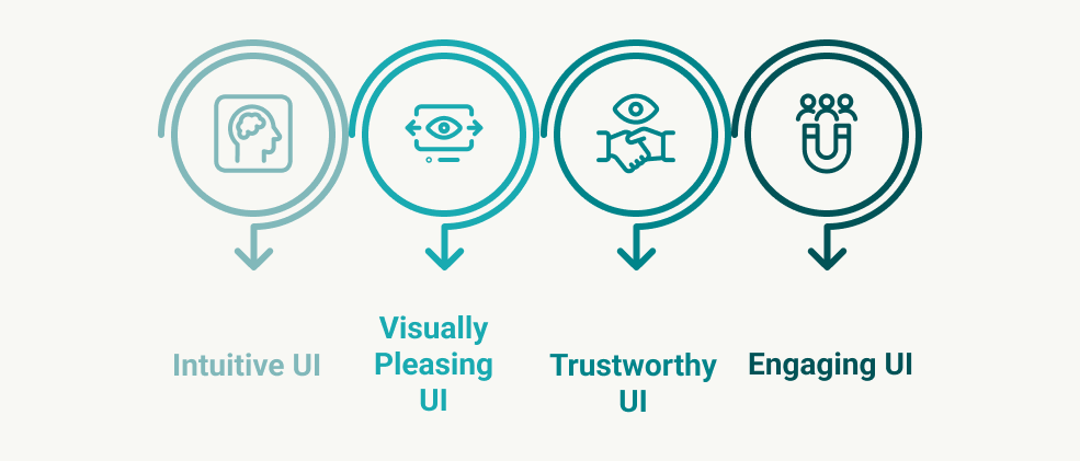
When every element is aligned and styled with precision, users naturally find the interface easier to navigate, more aesthetically pleasing, and more trustworthy, leading to better engagement and satisfaction. That’s the power of pixel-perfect design when it’s executed well.
Builds Trust & Credibility
A consistent, well-aligned interface makes a lasting first impression and leads users to trust it more. Users want to be able to trust the technology behind these visuals when everything looks intentional and polished.
Preserves Design Intent
Pixel perfection ensures that the final implementation stays true to the designer’s original concept. It maintains visual harmony, brand guidelines, and the overall storytelling envisioned during the design phase. Pixel-perfect design is the medium through which that fidelity is maintained throughout development.
Improves Accessibility & Responsiveness
A precise layout adapts better to different screen sizes and improves readability for all users. By following structured spacing and alignment, accessibility tools like screen readers also function more effectively. It also supports responsive web design and proper use of responsive CSS, ensuring that interfaces maintain visual quality and usability across devices. If you're looking for professional support, working with a responsive website design company can significantly enhance your chances of achieving both pixel-perfection and device-adaptability.
Pixel perfection can never be a one-person undertaking. True pixel-perfection requires close collaboration and clear communication between designers and developers. Here are some tips to bridge that gap:
Understand Design Tools
Familiarity with platforms like Figma, Sketch, or Adobe XD is essential for accurately translating designs into code. Use inspect modes to extract exact measurements, font styles, color codes, and spacing guidelines directly from the source. These tools are critical in achieving pixel-perfect design. For those looking to improve these skills, platforms like Frontend Masters offer comprehensive courses that help front-end developers master tools and techniques for pixel-perfect execution in front-end development workflows.
Pay Attention to Details
Precision matters: match grids, alignments, typography, and colors exactly as defined in the design. Small inconsistencies in line height, padding, or font weight can significantly affect the overall look and user experience.
Tool | Purpose | Example Usage |
PerfectPixel (Chrome) | Overlay design files for live comparison | Align UI elements by comparing to a PNG/JPG design |
PixelSnap (Mac) | Measure gaps and alignment on-screen | Ensure consistent spacing between elements |
Zeplin / Figma Inspect | Inspect specs and export assets | View padding, margins, and fonts directly |
Browser DevTools | Live CSS and layout inspection | Use the Computed tab for accurate box model checks |
Stylelint / Prettier | Maintain code consistency | Automatically flag and format CSS issues |
Use Grid Systems & Layout Tools
Leverage CSS Grid, Flexbox, or Bootstrap for structure and alignment, especially vital in responsive web design.
Use Precision Tools
Tools like PixelSnap or PerfectPixel (Chrome Extension) help ensure element-level accuracy.
Follow Typography Guidelines
Maintain consistency in font sizes, weights, and line heights.
Watch Spacing & Margins
Apply the 8pt spacing system or use design tokens for uniformity.
In all these practices, using responsive CSS techniques ensures that designs remain pixel-accurate across screen sizes while maintaining usability. These are fundamental principles for achieving true pixel-perfect design.
Font Rendering Differences (Chrome vs Safari)
Fonts may render slightly differently across browsers, especially on macOS (Safari) vs. Windows (Chrome). Use system fonts or web-safe alternatives to mitigate these discrepancies.
Example: Consider using font-family: 'Helvetica Neue', Arial, sans-serif; to ensure more consistent rendering across browsers.
Design Inconsistencies
Small design differences may arise during development, particularly if the design files are complex or lack detail. Use design tools like Figma Inspect or Figma’s Inspect panel to verify measurements, colors, and typography directly from the design files.
Example: Compare the color codes or measurements in Figma inspect and your code to catch any misalignments early on.
Lack of Clear Handoff Documentation
Poor handoff between designers and developers can be confusing. Clear, detailed documentation with exact measurements, fonts, colors, and behavior expectations (e.g., animations or transitions) is essential. Tools like Zeplin or Figma offer an organized way to share assets and specifications.
Example: Use Zeplin to get precise pixel measurements and export assets directly, reducing manual errors.
This distinction is especially relevant in the context of pixel-perfect vs responsive design. While pixel perfection strives for exact visual alignment, responsive design emphasizes flexibility and adaptability across various devices. Striking the right balance between the two ensures that your interface looks good and functions well, regardless of the user’s screen size or browser.
Aspect | Pixel Perfect | Practical Perfection |
Goal | Achieve an exact visual match with the original design across all screens and browsers. | Aim for close alignment while allowing small trade-offs for better performance or UX. |
Feasibility | Not always achievable due to browser, OS, and device rendering differences. | A more realistic and flexible approach, especially for responsive web design and cross-platform apps. |
User Experience Priority | May focus heavily on visual accuracy, sometimes at the cost of usability. | Prioritizes speed, accessibility, and usability over minor visual discrepancies. |
Performance Impact | Can lead to heavy code or animations that slow down performance. | Optimizes for lightweight design, faster load times, and smoother interaction. |
When to Use | When design precision is critical, such as in branding-heavy websites or UIs. | When strict accuracy delays delivery or impacts performance, ideal for scalable products. |
Example | Matching exact pixel values for font size, spacing, and alignment across all devices. | Accepting slight layout shifts to improve responsiveness or reduce animation load. |
Pixel perfection is not simply a technical experience; it is a mindset that includes a sensitivity to design, the skills to implement it, and attention to detail. It is a measure of a front-end developer's commitment to creating polished, deliberate, and user-centric digital experiences. When done right, it creates experiences that not only look impressive but also function in ways that have very few issues. Working towards a pixel-perfect aesthetic requires knowledge of CSS, an understanding of responsive CSS, responsive web design principles, an understanding of browser differences, and ultimately working with designers.
If you're looking to upskill in this area, Frontend Masters provides valuable training resources on advanced front-end development techniques, design implementation, and UI development—perfect for developers aiming to master pixel perfection.
There will be times when it is difficult to achieve exact pixel matching across every platform, but striving for pixel perfection will prescribe best practices, yield better results, and result in products that are much cleaner and impactful.
At Seaflux Technologies, we deliver top-notch custom software development services with a strong focus on pixel-perfect execution and responsive design. Our expert team offers specialized front-end development services and front-end web development services to ensure clean, consistent, and high-performing user interfaces across all devices.
As a reliable responsive website design company, we also provide full product solutions with our full-stack development services, aligning visual design with robust backend functionality.
Connect with us today to bring your digital vision to life, beautiful, responsive, and built with precision

Software Engineer