Introduction:
ScrollView is a feature that we as developers most commonly use to show the content that cannot fit in a mobile’s screen but, since we use this feature so extensively we sometimes ignore the fact that we can do much more than simple scrolling.
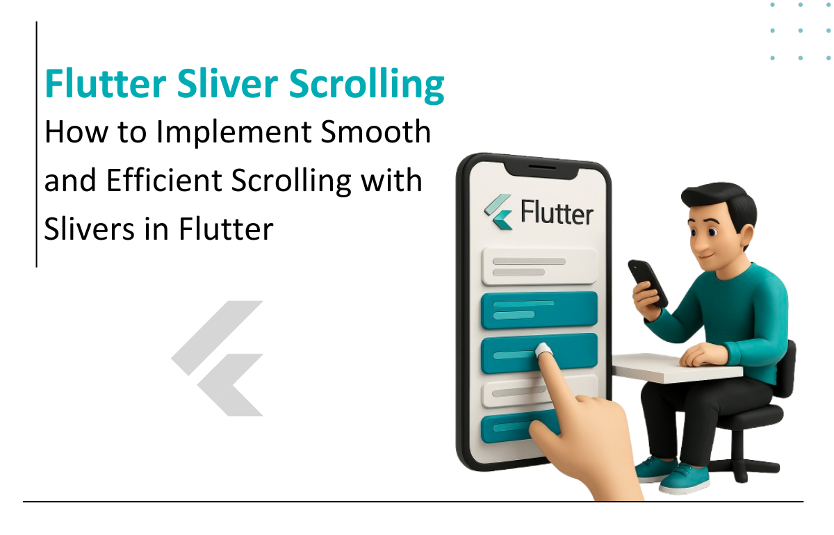
In this blog, we are going to introduce you to a new way of scrolling in Flutter which can be achieved using Slivers and CustomScrollView. With this way of scrolling we are introducing dynamicity and animation that will no longer bore you.
Let’s Get Started!!
SliverAppBar Class:
SliverAppBars is typically used as the first child of a CustomScrollView, which lets the app bar integrate with the scroll view so that it can vary in height according to the scroll offset or float above the other content in the scroll view. For a fixed-height app bar at the top of the screen see AppBar, which is used in the Scaffold.appBar slot.
CustomScrollView Class:
A CustomScrollView lets you supply slivers directly to create various scrolling effects, such as lists, grids, and expanding headers. For example, to create a scroll view that contains an expanding app bar followed by a list and a grid, use a list of three slivers: SliverAppBar, SliverList, and SliverGrid.
Widgets in these <app-link link="https://api.flutter.dev/flutter/widgets/CustomScrollView/slivers.html" title="slivers"></app-link> must produce <app-link newTab='true' link='https://api.flutter.dev/flutter/rendering/RenderSliver-class.html' title='RenderSliver'></app-link> objects.
Implementation:
First of all we are going to add CustomScrollView as a child to the body of the scaffold which takes slivers as one of its properties through which we can add various scrolling effects. Now we are going to add a SliverAppBar in this property along with a title which will be displayed on the app bar.
For this case we are going to hide the title if the app bar is in its expanded view and show it when the app bar is in collapsed view.
The expanded height here has been set to 240 which is the maximum height till which our app bar can be scrolled down. The property pinned is set to true as we want our app bar to stay while scrolling but you can set it to false as per your requirements but note that we do not need to set it to false explicitly because it has a false value by default.
FlexibleSpaceBar class commonly used in the <app-link newTab='true' link='https://api.flutter.dev/flutter/material/SliverAppBar/flexibleSpace.html' title=' SliverAppBar.flexibleSpace '></app-link> field, a flexible space bar expands and contracts as the app scrolls so that the AppBar reaches from the top of the app to the top of the scrolling contents of the app.
slivers: [ SliverAppBar( pinned: true, leading: IconButton( icon: Icon( Icons.arrow_back, color: Colors.white, ), onPressed: () { Navigator.of(context).pop(); }, ), title:Container( width: MediaQuery.of(context).size.width, child: Text( "Sam's Pizza", style: TextStyle( color: Colors.white, fontSize: 16.0, fontWeight: FontWeight.w700, ), ), ), expandedHeight: 240, flexibleSpace: FlexibleSpaceBar( background: Image.network( "https://d2w1ef2ao9g8r9.cloudfront.net/images/restaurant.jpg", fit: BoxFit.cover, ), ), ), ],
Now, since we added the app bar it is time to add the scrollable part in the slivers. This scrollable part of the slivers can include SliverList, SliverGrid, SliverFillRemaining etc.
In our example we are using SliverList.
A SliverList that places multiple box children in a linear array along the main axis.
slivers: [ SliverAppBar( pinned: true, leading: IconButton( icon: Icon( Icons.arrow_back, color: Colors.white, ), onPressed: () { Navigator.of(context).pop(); }, ), title: Container( width: MediaQuery.of(context).size.width, child: Text( "Sam's Pizza", style: TextStyle( color: Colors.white, fontSize: 16.0, fontWeight: FontWeight.w700, ), ), ), expandedHeight: 240, flexibleSpace: FlexibleSpaceBar( background: Image.network( "https://d2w1ef2ao9g8r9.cloudfront.net/images/restaurant.jpg", fit: BoxFit.cover, ), ), ), SliverList( delegate: SliverChildListDelegate( [ for (int index = 0; index < 150; index++) Padding( padding: const EdgeInsets.only(top: 8.0), child: ListTile( leading: Image.network( "https://cdn.pixabay.com/photo/2017/12/09/08/18/pizza-3007395__480.jpg"), title: Text("Farmhouse Pizza"), ), ), Padding( padding: const EdgeInsets.symmetric( vertical: 20.0, horizontal: 20.0), child: ElevatedButton( onPressed: () {}, child: Text( "Next", )), ) ], ), ) ],
Here below is the final output. We have added a list of ListTile in the SliverList so as to fill the remaining space so that our app bar becomes scrollable. We hope that you try this out by yourselves.
Congratulations! you must have improved scrolling experience in your flutter apps now!
Any questions or confusions? We are more than happy to assist! Head on over to

Director of Engineering